When I started this blog 19 months ago, I never really cared about its design. I chose the most generic one so I can easily incorporate some design touches into it. If you look at my blog, I know what you are thinking. What design touches?! I know, right? I really did nothing, design-wise. I was busy filling it with content that the design took a backseat. At the start of the 2013, I thought about putting the blog redesign project as part of my goals for this year. I refrained from doing so because I did not like committing to something I did not think through. Lately though, I have been looking at fonts. I guess this is what I get for reading about Steve Jobs. He was obsessed about good design which made me rethink about my design choices for my blog.
I still cannot say with certainty that I will redesign my blog. For now, there 3 ideas that kept running in my head.
1. Fonts. I have read about people who are font snobs. What I learned from some of them is that Helvetica is a good font while Comic Sans is not. I think Helvetica is good because it is simple, clear and versatile. You can use it on formal documents as well as informal ones. Comic Sans looks like a child’s handwriting so it is informal. Confession: I used to like Comic Sans for it childish nature but I stopped using it since I read about its design flaws.
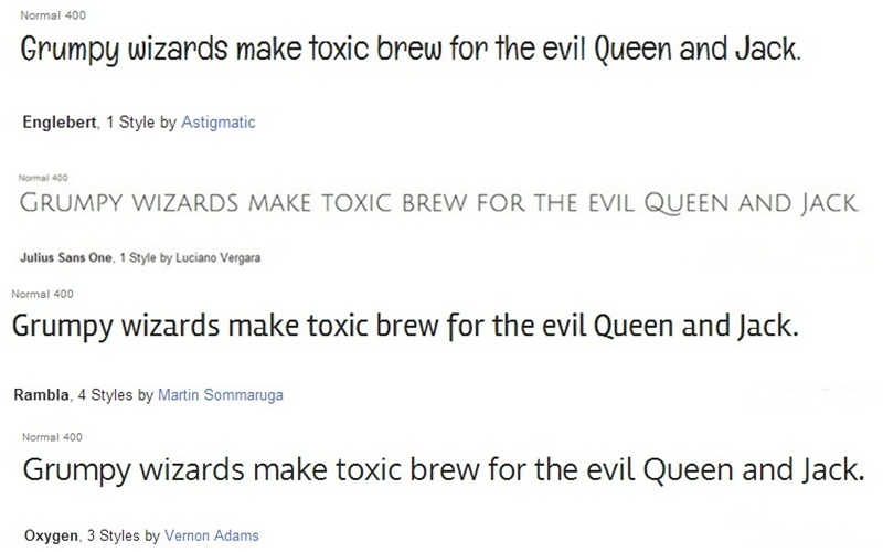
There are fours fonts I want to use for this blog and I am still open for other fonts that might catch my fancy. I just learned about Google web fonts and I am still figuring out how to use them in this blog. Here are my picks from Google:
I do not know if these are good fonts, design-wise. One font will be used for the blog post title and another for the content. What do you think?
2. Color. My blog does not have color in its design. I make up for it through photos. For 2013, emerald green is the Pantone Color of the Year. I don’t think I am warming up to the idea of emerald green for my blog. I am more of a pastel kind of girl. I am taking cues from Pantone’s Spring Fashion Colors for 2013 instead.

I like dusk blue, grayed jade, lemon zest and nectarine. We’ll see what I finally decide on.
3. Mobile accessibility. I really do not know how my blog looks on a mobile device since I do not own those fancy smartphones. However, it does make perfect sense to create mobile website because there are millions of mobile users out there. Those millions of mobile users are potential blog readers. I learned about Mobstac when I browsed through different LinkedIn pages. Signing up is free. I will consider their services once I decide on items 1 and 2 above.
So far, those are the things I am thinking when it comes to blog design. What other things should I consider?
Source: creatiwittyblog.com via Patricia on Pinterest


Other things to consider in your blog redesign is the functionality of the site as in ease for use to read your posts etc. Ease for you to do minor adjustments when needed and if further revamp is needed down the road.
Am thinking of a blog revamp too but haven’t yet decided on whether to change the template or not and if I should change the header again. I DIY all my blog makeovers and it has been fun 🙂
ease of use= simple layout. hehe
i not a techie, i like to redesign my blog too but i just don’t know how
i love verdana font it is simple and clear. =) I think for mobile accessibility, for bloggers they have a default view, it can be turned off or on if you like it. 🙂
Thanks, Aby. Actually, Verdana was my first choice then I got sidetracked when I learned about google web fonts. hehe
Yes, Aby is right. If you use the Blogger platform, you can preview how the site looks on a mobile device. You can tweak it right there.
I like the first font style. It would look good if you adapt a simple layout because it’s already fancy on its own. The overall design would be balanced. That’s just me, though. 🙂
Thanks, Maan! I use wordpress. I will look into something like that in wordpress.
Redesigning my site cymplified.com is my dream, I wanted to pay someone to do it, but I cannot decide on just one design, so it might be sayang. I got a freebie of having the Genesis framework (as my site is on wordpress) and a free theme, but there are times I want to change it up again. If you want to brand your site I think a logo is cool, too.
I use simple fonts to make it easy on the eyes when reading. I do have a simple design too no fuss, just clean white spaces. But someday I dream of having it designed professionally as well. 🙂
I like unique looking fonts like your first one, Englebert. I actually prefer a clean template like yours and just adding a header. Some blog designs look too cluttered with busy looking colors.
I use Blogger and chose one from the templates. I just added a header which is my own!
I think that is what I want to start first. Header. 😀
Your current font looks fine. If you want to change it, I like the last one Oxygen. When I started blogging in 2008, I read that a stark white background was important. Nowadays, people publish in all the colors. I would add some color to your blog with say, a fancy banner with colors and pictures. WordPress has a ton of awesome blog templates so choosing one that fits your need shouldn’t be so hard. Also add your links to your social media sites on your blog…
Keep us posted! BTW, I forgot to add my blog to this week’s bc list, a visit would be appreciated.
Eliz
Great idea on the social media link. I only have twitter and pinterest though. 😀
I’m planning to re-design my blog too. Hubby says it’s too girly, pink and polka seems to turn male readers off. 🙂
I am using Trebuchet MS in my two blogs. But I would love to use the first font style in my craft blog. Hehe. Thank you for the tips 🙂
Mommy Maye2
Wow. You know your fonts!
Mommy used to design my blog when I started. But now, I am the one who does it. Mommy is my critic. She used to tell me the fonts to be used as well as the colors. She said to me that I should choose something pleasing to the eye of the readers from font to background.
She knows her fonts. She knows what she wants. 😀
I started doing research and more research with the blog I currently have now. Redesigning it is a major move for me since I’m not techie enough to know what to do or not.
I like the changing of fonts by the way. I like the first one. 🙂 My template now is a downloaded template so I can’t change much. I might ruin the whole thing.
I would love to do a blog redesign too cuz it is all pink and girly and funny ha, I was also looking at google fonts yesterday 🙂
They have nice fonts. 😀
i love the first font. a bit informal but i like looking at fonts that are somewhat like handwritten. but i agree. it ends up looking a little informal.
Me, too. I like handwriting-looking fonts. 😀
I don’t think I could be a big help since I have the same problem too. haha! But I’ve learned a lot about blog re-designing, fonts and all from the comments. 🙂
Me, too. I’m glad I put this out. I am learning a lot.
Blog designing is fun especially if you are the techy type. But for those who are not, it could be a very difficult process. I also love to be able to do my own design but it eats up a lot of my time, so I always postponed it.
Blog or page loading time must be included and taken seriously as well. Good luck at your redesign.
Love your font and color picks! I’ve had blog redesign for my main blog on my list of goals for a loooooong time. Buti ka pa meron ka nang napag isipan, ako wala. haha!
Sana magawa ko! waaah!
I love the lemon zest and african violet… good luck to your blog makeover..
I hope I can do this.
Redesigning your blog is totally time consuming but hey if it’s worth changing it then go with it. Just make sure to have some important things in it.
Readability
Catchy designs but not an eyesore
Just be sure to inject your personality in it.
I prefer simple and clean layout, too. I also think you need to give serious thought on your photos. The size and how it will come out in the post. I know WordPress sometimes can be unwieldy when it comes to photos/images. 🙂
sometimes, it is hard to redesign our blog. you have to re-install everything.
Your blog design now is a type of minimalist and I think it’s cool that way. And I love the fonts you picked too!
If you are on the safe side of blog designing, your fonts should be limited to those that are available in all systems by default. I had a mistake of using a font in my blog that was not readily available to everyone. When I tried accessing it in another system, voila… my blog was a mess!
While reading your posts, I became conscious about my blog. Because I adore black, my blog theme is related to the black family. I intend to have the background black because any color can be used to it. I will just blend. I usually use the font Georgia and I italicize it. I don’t like background which are animated. I will be better to put some color to your blog to make it more alive. 🙂
I like the astigmatic font…not too serious, not too playful, I think. I think it’s cool. The colors are also nice. If I were to choose, the background should be as light colored as possible. I’m more partial to light colors when it comes to page backgrounds. The accent colors (for the fonts, headers, titles, etc) could be any of the pantone colors you have there.
ohhh… i am also planning of redesigning / overhauling my blog and i am currently looking for a blog designer who could help me since i don’t have any idea on how to do it by myself….
Before I wanted to make my own design for my blogs but after several tries, I realized I am no techie in web designing. So I dropped the idea and made use of pre-made templates available online. 🙂
A good template is important too. I was tempted to invest in the past but decided later on to manipulate the html thingy. It worked for me 🙂
I like experimenting on fonts, but not on my blog. I go for readable fonts only.
[…] thought of redesigning this blog has been in the back of my head since I wrote about it last February. I never really had the time to sit and plan how I am going to go about it. I would […]